Developing design ideas
These design development are all taken from my selections in the last exercise.
1.
1.
 |
| My starting point |
I used Paint.net to manipulate this image. This ceases to be grasses blowing in the wind and suddenly becomes ribbons being twirled very fast.
 |
| Effect - Motion blur set at 200 |
I went back to my starting point and used the Dents effect....
 |
| Effect - Dents |
Scale 200
Refraction 30
Roughness 45
This looks like an ink drawing
.......then I put a 95 motion blur on the top and it became a watercolour.
These effects raise all sorts of possibilities particularly with the silk painting coming up soon.. The lower one reminds me of the work I did about mingling colour.
2.
This is bleach on red tissue paper.
 |
| Another beginning........ |
 |
| ....and another idea. |
This took quite some doing but I'm delighted with the result. I made four tiles and turned them to create a single image. I can imagine this as a repeated block print.
I couldn't resist trying it in a dramatic black and white so I returned to Paint.net. I like the faint hint of red that remains.
3.
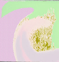
This image doesn't present me with such obvious ways to develop as the first two did. I'll have to think harder for this. I suppose that is the object of the exercise - selection is all.
The image is soft and quite gentle. I decided to isolate the basic shapes and replace the softness with hard edges but use harmonious colours. I'd no real idea whether what appears to be a mis match would work. And really I'm still not sure. I've changed the focus of the piece by lightening the top element and this has made a huge difference. It may be this will grow on me; we'll see. One thing I have learnt is that time is on my side. Sometimes an idea for an improvement occurs days after the work has been first made.
4.
I like the texture and drama of this drawing and I wonder how much that is dependent on the colours. The drawing was developed from a computer manipulation so I returned to try the computer to try different colourways.

....so I went back to my soft pastels.
This was better than the computer generated images but still unsatisfactory. I reduced the points on the design and rounded them off in a nod towards the harmony I thought I'd get. It is a pleasant enough image but lacking any sort of focus. I'm sure the absence of a negative space is something to do with how I feel about this work. So I think the answer to my question is "Yes, the success of the design is colour dependent".
I returned to the colours I love, printed some tiles and did some sticking to make repeat patterns.
I didn't really know what to expect from this but I played about for ages. It took me quite some time before I realised that I'd only made two different patterns! They do however, take on different aspects when they are turned around.
This is so much more comfortable than the pastel designs.


No comments:
Post a Comment