Monday 25 February 2013

Marrakesh sketchbook highlights

Marrakesh sketchbook highlights

Before
Customising my holiday sketchbook

At the suggestion of my tutor I'm going to take an A6 sketchbook with me to Marrakesh.  Liz has made a variety of useful suggestions about keeping sketchbooks but for me the most valuable is the notion that my sketchbook is a visual diary.  I had read this previously (before I actually started the course) in Kay Greenlees Creating Sketchbooks but I find I understand it much better now.

I'm going to customise my sketchbook cover and I've decided to look at Islamic tiling patterns.  Liz has encouraged me to investigate this area and I'm going to an Islamic country so it seems very apt.

I Googled Islamic tiles and got a mind blowing selection of very, very complex patterns.  I came across this blog

http://morphingtiling.wordpress.com/2010/12/24/islamic-art-and-tilings/#comment-14

which seemed to offer me an easier way in.

This is my starting image taken from the blog:


My initial sketches


 I started with a square and took a line from the corner to a mid point on the opposite side.


Then I erased some of the lines to leave a right angled triangles. Simple enough.


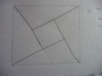
Then I placed 4 tiles together and started to see it might be harder than I'd thought.  However, I wanted to pursue it further so I delved into long forgotten geometry knowledge and began an accurate pattern.


This is not easy to see because it's on grey sparkly card but after a bit of experimentation with scale I began by constructing a 2cm inner square


Nearly there
This little gadget helped me to erase my construction lines

Done!

I tried various colour schemes and made my choice:


I began with red squares

Then put in yellow horizontals

And finally the green


At each stage the optical effects changed.  The red squares on their own danced but became much less prominent with the addition of the yellow.  The green pulled everything together.  The finished effect changes if you stare at it.

What seemed to be a simple is in fact very complex and it's taken me most of the day.  Whilst I may not do such a task again I am spurred on to do some reading and my trip to Marrakesh might take on a different aspect.

I painted it with a couple of coats of diluted PVA to give it some durability.  Here's the result; I'm hoping the glue marks will dry.


I'm surprised how different this makes my sketchbook feel; it's not just a cheapo from W H Smith but something that feels mine.


Using my skethbook


My first page gives a brief overview of how I customised the cover for my sketchbook.

The next one is inspired by the mundane task of packing - I've called it "Hand baggage only" because I'm travelling light expecting to bring loads of stuff back.  As I made my pile of clothes I was struck by the layers and the way the colours harmonised (in the interest of clothing economy).  This snip shows what I mean.


From here I developed a collage in paper and various bits of ribbon.  It's a colour combination that's arisen before.


I thought of textural words and tried to develop some differentiation in a very samey theme.  I think the cable cardigan in the middle has lovely texture but the material I chose in the collage looks a bit hard.  Generally speaking though I'm quite pleased with this.

It feels very strange working in such a small (A6) space.  It took me ages at the beginning of the course to start to thinking bigger so I'm amazed at myself for feeling such a thing.

As I filed my hard copy (just in case) I caught a glimpse of the photo at an oblique angle.  Incredibly it offered me the most wonderful landscape.  I can't think of a way to show just how amazing this was but it's something I'll be back to.  How can a pile of clothes change into water, rock and cliffs?

Seeing an image from an angle and getting a completely different perspective has happened to me before and it's something I'll be looking for now.

After
Now that I'm back home I can truthfully say that I really enjoyed keeping my sketchbook and I'm sure the exercise helped me to realise how valuable a resource it can be.  I only took a basic toolkit so there were no scissors and I missed them like mad.  This is a sample of what I did:


Carrier bag collage......
............from the souk

 I spent some time drawing some old tiles I came across.  They were very rustic and some of them were tricky to draw.

Antique tiles

More old tiles


I had forgotten all about tea bags being made out of cloth


Just outside our hotel there was a red mud wall reinforced with straw.  I drew the marks the straw made without looking at what I was doing and I got a very good image of the texture. I put a colour wash on.  It's a bit striated because I used pencil crayons and water.


I did some more work on the textures of the wall; making marks and seeing what worked:


My favourite is this one.  It's textured paper I'd put in my sketchbook with a colour wash.


Shame about the weather!

Saturday 23 February 2013

Mantua gown, The Collection, Lincoln

Mantua gown, The Collection, Lincoln


I visited an exhibition that displayed this lovely gown(really a coat).  I could spend time I don't have writing about it but it seems a much better idea to put in a link and let you see for yourself.

http://www.lincstothepast.com/exhibitions/treasures/18th-century-mantua/

The dress was beautiful but I found the exhibition unsatisfying from the point of view of information.  I wanted to know about the conservation process and the fabrics but instead it focused on how lucky we are to have the dress (which indeed we are).

There was a talk a week or two ago by Sheila Landi,the conservator, but the tickets were sold out when I tried to buy one.  This might have given me what I felt was missing in the exhibition.


Thursday 21 February 2013

Assignment 2 Notes from my tutor report


Notes from my Tutor report
Things to do

Consider how you might develop your sketchbook work further and use this to inform the development of your design ideas. 
It is my priority for the next week or two to get to grips with using my sketchbook properly. It has been an area of great uncertainty.

Develop a cross referencing system.
Another priority

Undertake further study relating to the traditional designs and include the material in your learning blog. There could also be some rich source material for future work. 
The patterns which intrigue me so much will no doubt crop up in my ideas for my Theme Book. I love looking at this area and am glad to be encouraged this way.

I would urge you to delve more deeply into Islamic and Moorish art.
No urging needed – I love it and will be trying to incorporate more of it.

Take the sample based on autumn leaves further as a basis for a stitched sample. 
I’ve already tried this with a collage but it didn’t work for me.  I feel that Liz is right it could be a lovely thing to work with.

Try folding the dry cloth and then dipping the folded edges into the bleach. You will then begin to build up patterned areas not dissimilar to tie dye.  
Something new to try.

Of the two samples you produced for stage 4, I felt that the orange/yellow /black design from your earlier pastel drawing worked best. The composition was much more balanced than the mauve circle which I felt was a little bottom heavy.  This might be a good design to re work using layered tissue to create a much softer feel. Give some thought to the position of the solid shapes in relation to the background area. Would it be a more balanced design if you were to move the shapes further up the circle? Think about what you learned about composition earlier.
This needs some time to consider - I'll look at it when my work comes back.

Liz included a tutorial on fusing plastic and I’ve tried it already. Not a great masterpiece but it’s showed me new possibilities like stitching into it or using fragments in other work.  It’s also good for experimenting with colour – thank goodness I have a carrier bag stash. It’s hard to judge the right temperature for the iron and I found that as it cooled there was some curl to the fabric. There’s lots to play with here.


Questions to address

Colour, mood and theme was well handled and I was pleased to see that you made good use of symbolic colour association as well as utilizing the mark making work you completed in assignment 1. In terms of applying what you have learned, how do you think Picasso used the above to create the atmospheric mood in the painting you included in your sketchbook? 
He used blue which is a cool colour to depict sadness. I'll look at it again from the point of view of mark making.

Experimental samples with stitch showed the extent to which a black background can leach the colour from cool colours such as blue. However, as you discovered, by placing the blue next to warmer colours such as yellow, or a lighter tone, the balance is restored. What insights might this give you when selecting surfaces for future stitch work? 
Treat the stitching surface as a foundation for everything else.  I’ve already found that if the surface isn’t right nothing else works.  I also learned that doing a small sample pays dividends because I can see what happens to the colours before I launch into something larger. I should think carefully about the mood I want to create and combine the surface and the other materials to achieve it. I need to consider the effects of one colour on another from the word go and not as I’m working. For instance, one line of blue against a similar one of yellow does not give the same effect of a line of blue against significant yellow. This means becoming intimately acquainted with my colour wheel.

Other interesting effects were noticeable when you increased the density of stitch and the thickness of the yarn used. Did you notice the emergence of the secondary orange in your red and yellow spiral? Try looking at it from a distance to see this more clearly.  
I’ll do this when my work returns but I think I know what Liz means here.

The machine embroidered samples on dissolvable fabric were a good learning experience for you. As you discovered, stitch density is a key factor in achieving success and you have clearly sorted out your tension problems. There was some great colour blending here when you varied the thread colours in the bottom spool. How far do you think you could push the buildup of surface texture? 
I think the amount I use the machine is limited to its capacity for the thickness of the fabric I make.  After that I could apply stitching by hand as I would with any other fabric. I’ve not thought of using fabric I make by machine as a base for applying other stitching – exciting.

Your first sample (Project 4 Developing design ideas) did make good use of the simple fragmented red and yellow paper cuts. Experimentation with varying the negative black spaces was very useful. Which of the spacings did you feel worked best in terms of the overall balance, rhythm and harmony of the design? Why was this so
I’ll check this out when my work comes back.

The first design in contrast worked well as a single image and also as a repeat pattern, especially when mirrored and rotated. Ask yourself why this design is so successful. You also mention that this design is ‘more comfortable than the pastel design. Why is this?
I’ll check this out when my work comes back.

Suggested reading/viewing
Greenlees K    2004    Creating sketchbooks for embroiderers and                                                                            textile artists
Hedley            G         2000    Surfaces for stitch. Plastics films and fabrics

Luckily I have these books.  The Kay Greenlees one should help a lot.  I read it before the course started but haven’t looked at it again since.

Project 6 Stage 3

Applique practise


I set myself the task of thinking of different ways to stitch fabric onto fabric.  For the purposes of creativity I've decided that nothing I suggest will be washed!

The whole sample

I used calico as my surface and cut up some felted wool from a jumper kindly ruined by a friends' mother in law.  To make it easy I applied some Bondaweb.


Just running stitch - very functional
Lots of French knots


All lengths and all angles

Organza ribbon and stitches

Very few stitches - needs Bondaweb

Several layers held by a bead and Bondaweb


Some of these are purely decorative and need webbing so that they lie flat to the fabric.  I like them all but I think my favourite is the one with just a few stitches it's really energetic.  More sedate and "pretty" is the one with French knots.

Next I decided to try some reverse applique where the fabric for the insert is underneath the main fabric.  I also wanted to try sandwiching some bits with Bondaweb so I thought I would combine the two tasks.

First I made my fabric from all sorts of bits, organza, fabric scraps, bits of cotton and some sequins.


It was very hard to photograph but by placing it against a window I got a fairly accurate picture.
I wanted to place this behind some of the dark grey felted wool I'd used earlier.  Not being the worlds most logical thinker I got into a tangle with Bondaweb (that with hindsight I shouldn't have touched).
I ended up with the job of retrieving something from a bit of a mess.


This is the reverse applique that had Bondaweb on it.  I couldn't get it off so I put some sheer fabric on the top.


This is the back.  I always try to be positive so what I now have is a reversible piece of work completely by accident!  What a learning curve.


 My granddaughter is 2 next week so I decided to make a card using the Bondaweb and tiny bits of stuff.  This is the result.  I had to cut it to shape so some of the glitz disappeared but it is really pretty.


I've wanted to use some of my previous work and develop it a bit so my next experiment was with some printing I did earlier in the course.  It took me a long time to settle on which fabrics to use for the applique; everything I liked seemed far to heavy.  Eventually I hit on this combination of plastic bags, paper and sinamay.  Nothing is stitched on around the edge but it is held by stitches radiating from the centre of the flowers.  I like this and I'm enjoying thinking differently about the materials I use.


Beaney J.  1993,   The Art of the Needle. Pantheon Books. New York
Reid, A. 2011, Stitch Magic.  A C Black. London

Sunday 17 February 2013

Project 6 Stage 2

Developing ideas


I've chosen a selection including photographs to work with this time.  I've spent a long time playing with the images and looking at my fabrics and there are often clear links between the images and the collages.

1.
The first image is of the roof of the Corn Exchange in Leeds.  I loved the roof because of the multitude of shapes it made and the intricacy of the apparently simple structure.  I've played with it on the computer using Paint.net and found some interesting effects and combinations.


The top picture shows the roof as seen.

The other images are manipulations on the computer.  The lower image shows the top of the roof placed back to back.   


Here there is another computer manipulation called Twist.  On the near picture I've flipped the image to create a shape that has a central focus.


All the variations offer a different perspective but there's nothing that sets my pulse racing.  Knowing that I need to simplify things a bit I selected just a part of the roof and came up with this - nothing much to recommend it I thought.


Then I moved things round and found this more pleasing.  Although the lines are still the main focus the diagonal movement lends much more interest.  It's quite out of focus (which I like). It seems a real contradiction to the sharp original picture.  As the image has been enlarged and enlarged colours have emerged.  Something to do with pixels I'm told.


I like the way the shapes are dependent on each other (just like the elements of the roof) and offer a certain harmony as triangle feeds into triangle.  It reminds me of the puzzle where you have to count the triangles.  Essentially the roof is painted all the same colour but the shadows created make the shapes really stand out. I am thinking of railway tracks and drain covers.  I can see this has possibilities.

One of the things I liked about my first photo was that it was light and airy  There were no windows in the roof, in fact it was very solid, but there seemed a lightness of touch.  I wanted to capture that in fabric and explore the colours that emerged on the enlargement.

To do this I played for ages with layers and got some surprising results.  Eventually I settled on some bits of gold organza and pink net scattered on grey card........


.........covered with an unknown bonded fabric in silver......


It amazed me how much colour came through the bonded fabric; it gave me just what I wanted - hints of colour.

I tried to evoke the diamond roof pattern with the silver motifs and the beams in silver ribbon.  I think they have given the lightness I was aiming for.


2.
I often take photos in my garden and this one is of the bark of a cherry tree (prunus serrula).  The tree has something to offer that is beautiful throughout the year and last August the bark started to peel uncovering this wonderful gold underneath.  Before I pursue this I'll go and look at what's happening to it right now.


When I look at this I see something very flashy; it glitters and gleams whichever surface you look at.
I isolated the top part of the image and stacked two together.


Then I turned them round to make a horizontal image.  I'm left with lustrous, tactile stripes that shriek ribbons and shiny bits.  It reminds me of a Picasso painting I used in the colour section of the course.

Sketchbook no 66, p21
Picasso 

The colour bag I made
This doesn't figure in my collage work but I might use it in the next exercise


3.
I took pictures at the Yorkshire Sculpture Park last year and had the notion that I'd like to put the folds in the clothing on Henry Moore's Draped Seated Figure back into textile form.

Draped seated figure
Henry Moore

Torso detail


I admire the way the stone really does look like fabric; the folds carved in relief create sometimes deep shadows that define the movement of the material.  Because in has been in situ for some time it is weathered and there are lichens growing on the stone; it is very tactile.  This photo shows a variety of colours that on a casual glance wouldn't be so evident.  The shapes of the folds almost follow the same line but not quite and I think this creates interest.

Without being able to stitch it would be hard to recreate the folds so I'm going to take another idea and weave using the fold lines as my cutting lines.  I'm using hessian because it seems fitting and I've painted it in some bright lichen colours.

Painted like lichen


A try with paper first I think.  I printed the photo twice, cut them identically then wove them together.  I was delighted with the result.

A dummy run with paper
I used my painted hessian and an unpainted one.  My reasoning was that when the sculpture was new it would have been without lichen and when I saw it it wasn't.  It was hard to prevent the hessian fraying.

My weaving

This is completely underwhelming; not at all what I'd hoped for.  I like the paper trial much better there's more contrast, life and texture.


4.
This is another garden photo; this time it's epimedium grandiflora which I grow for it's leaves.  They are especially colourful in winter. The leaves are heart shaped and from the base there is a lovely network of lime green veins.  In this photo the shadows give a good impression of the depth of the plant;  I once found a hedgehog hiding in the shadows.  On some of the leaves the pink predominates and on others it is the green.


I selected a part in the top right hand corner because the pink and green are quite equally balanced.


 I played about on the computer first and got this lovely image....


and  I enlarged it considerably until it was quite blurred.  I then drew around the pink shapes.  What I've ended up with looks a bit like a street map of a badly planned town with the spaces between the blocks being roads and vital to the smooth running of the whole.


I thought this drawing looked nothing like a leaf until I glimpsed it from an angle; what a surprise -


The central area is clearly visible and the "ribs" show as well.

I have isolated just a small part to develop a leaf shaped collage.  I have tried to keep the "rib" central


There is a system to the shapes and I think of continental drift as they float apart.  I transferred the shapes to some loosely woven linen and cut them out.  I realised too late that I should have applied Bondaweb, it would have been much easier to cut.


I eventually put on Bondaweb and put some painted silk at the back.  I tried plain materials but it didn't work.  The various colours in the silk give just the effect I wanted.  The colours were determined by the silk I had already painted. Because the materials I have used are thin it looks lovely backlit so I mounted it on lime green translucent plastic and gave it a stalk of sari silk.


The end result bears some resemblance to the epimedium in my picture but the colours and texture are changed and it has become more abstract.

5.
This is a print on paper that I made in an earlier exercise and I find it very satisfying.  The colours are exciting and there's a busyness to it because it has a lot of dynamic shapes.  It is a picture developed from autumn leaves so there is a feel of ending about it as well.  The dark shapes around the edge have a black hole quality; who knows what lurks there.  I'm interested in whether the mood changes if I present something in fabrics.


I used some batik as a background (the colours have not photographed well) and I isolated the smudgy shapes and cut them out of various fabrics.  I punched holes and put different fabric behind the holes.  What was smudgy in the original  took centre stage and I hadn't intended that.


This hasn't worked as I had hoped and I think it's because I chose the wrong focus.  I shouldn't have selected what was a subdued background and made it more prominent than in the original design.
No black holes here.


6.

Although I can't say I'm a great fan of crimplene I liked the texture of this example. The motif is loosely a floral, a repetitive pattern and in just two shades of sea green.  It makes me think of looking over the edge of a cliff down into a rippling sea - at Sennen Cove in Cornwall to be exact about it.  I think the darker shapes are deeper water, the day is warm and there's little breeze to disturb the waters surface.  I don't want to do anything else with the image; just try to capture the feeling of the remembered day.


I'm so pleased with this.  I particularly wanted to keep the colours sea like.  I introduced blue at one point and it was so wrong.  I've used large cell bubble wrap and filled some of the bubbles with various fibres; angelina, wool, organza strips etc.  The colours are harmonious as are the little beads.  I introduced some novelty wool wrapped into round shapes and that gives some additional froth. I mounted the bubble wrap on layered organza and that in turn went onto silver card.

It has been a real treat to have all my fabrics out and have time to experiment with what works with what.  It has surprised me that I'm  getting to know what to look for and what will work.  Although I
Still make mistakes I'm starting to recognise what's wrong.


I still often make mistakes they are getting less.