Marrakesh sketchbook highlights
BeforeCustomising my holiday sketchbook
At the suggestion of my tutor I'm going to take an A6 sketchbook with me to Marrakesh. Liz has made a variety of useful suggestions about keeping sketchbooks but for me the most valuable is the notion that my sketchbook is a visual diary. I had read this previously (before I actually started the course) in Kay Greenlees Creating Sketchbooks but I find I understand it much better now.
I'm going to customise my sketchbook cover and I've decided to look at Islamic tiling patterns. Liz has encouraged me to investigate this area and I'm going to an Islamic country so it seems very apt.
I Googled Islamic tiles and got a mind blowing selection of very, very complex patterns. I came across this blog
http://morphingtiling.wordpress.com/2010/12/24/islamic-art-and-tilings/#comment-14
which seemed to offer me an easier way in.
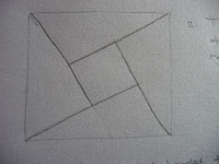
This is my starting image taken from the blog:
I started with a square and took a line from the corner to a mid point on the opposite side.

Then I placed 4 tiles together and started to see it might be harder than I'd thought. However, I wanted to pursue it further so I delved into long forgotten geometry knowledge and began an accurate pattern.
This is not easy to see because it's on grey sparkly card but after a bit of experimentation with scale I began by constructing a 2cm inner square
I tried various colour schemes and made my choice:
At each stage the optical effects changed. The red squares on their own danced but became much less prominent with the addition of the yellow. The green pulled everything together. The finished effect changes if you stare at it.
What seemed to be a simple is in fact very complex and it's taken me most of the day. Whilst I may not do such a task again I am spurred on to do some reading and my trip to Marrakesh might take on a different aspect.
I painted it with a couple of coats of diluted PVA to give it some durability. Here's the result; I'm hoping the glue marks will dry.
I'm surprised how different this makes my sketchbook feel; it's not just a cheapo from W H Smith but something that feels mine.
Using my skethbookwhich seemed to offer me an easier way in.
This is my starting image taken from the blog:
 |
 |
| My initial sketches |
I started with a square and took a line from the corner to a mid point on the opposite side.

Then I erased some of the lines to leave a right angled triangles. Simple enough.
Then I placed 4 tiles together and started to see it might be harder than I'd thought. However, I wanted to pursue it further so I delved into long forgotten geometry knowledge and began an accurate pattern.
This is not easy to see because it's on grey sparkly card but after a bit of experimentation with scale I began by constructing a 2cm inner square
 |
| Nearly there |
 |
| This little gadget helped me to erase my construction lines |
 |
| Done! |
I tried various colour schemes and made my choice:
 |
| I began with red squares |
 |
| Then put in yellow horizontals |
 |
| And finally the green |
At each stage the optical effects changed. The red squares on their own danced but became much less prominent with the addition of the yellow. The green pulled everything together. The finished effect changes if you stare at it.
What seemed to be a simple is in fact very complex and it's taken me most of the day. Whilst I may not do such a task again I am spurred on to do some reading and my trip to Marrakesh might take on a different aspect.
I painted it with a couple of coats of diluted PVA to give it some durability. Here's the result; I'm hoping the glue marks will dry.
I'm surprised how different this makes my sketchbook feel; it's not just a cheapo from W H Smith but something that feels mine.
My first page gives a brief overview of how I customised the cover for my sketchbook.
The next one is inspired by the mundane task of packing - I've called it "Hand baggage only" because I'm travelling light expecting to bring loads of stuff back. As I made my pile of clothes I was struck by the layers and the way the colours harmonised (in the interest of clothing economy). This snip shows what I mean.
From here I developed a collage in paper and various bits of ribbon. It's a colour combination that's arisen before.
I thought of textural words and tried to develop some differentiation in a very samey theme. I think the cable cardigan in the middle has lovely texture but the material I chose in the collage looks a bit hard. Generally speaking though I'm quite pleased with this.
It feels very strange working in such a small (A6) space. It took me ages at the beginning of the course to start to thinking bigger so I'm amazed at myself for feeling such a thing.
As I filed my hard copy (just in case) I caught a glimpse of the photo at an oblique angle. Incredibly it offered me the most wonderful landscape. I can't think of a way to show just how amazing this was but it's something I'll be back to. How can a pile of clothes change into water, rock and cliffs?
Seeing an image from an angle and getting a completely different perspective has happened to me before and it's something I'll be looking for now.
After
Now that I'm back home I can truthfully say that I really enjoyed keeping my sketchbook and I'm sure the exercise helped me to realise how valuable a resource it can be. I only took a basic toolkit so there were no scissors and I missed them like mad. This is a sample of what I did:
 |
| Carrier bag collage...... |
 |
| ............from the souk |
 |
| Antique tiles |
 |
| More old tiles |
 |
| I had forgotten all about tea bags being made out of cloth |
Just outside our hotel there was a red mud wall reinforced with straw. I drew the marks the straw made without looking at what I was doing and I got a very good image of the texture. I put a colour wash on. It's a bit striated because I used pencil crayons and water.
I did some more work on the textures of the wall; making marks and seeing what worked:
My favourite is this one. It's textured paper I'd put in my sketchbook with a colour wash.
Shame about the weather!


No comments:
Post a Comment